User Guide
Introduction
The craceplot package provides a set of functions to create plots to visualize the configuration data generated by the configuration process implemented in the crace package.
The configuration process performed by crace will show at the end of the execution one or more configurations that are the best performing configurations found. This package provides a set of functions that allow to further assess the performance of these configurations and provides support to obtain insights about the details of the configuration process.
Installation
Install craceplot from pip
pip install craceplot
Install craceplot from conda
conda install craceplot
Excuting crace
To use the methods provided by this package you must have completed crace log files from a single run. The folder including all log files object is defaultly saved with name race_log after each crace execution.
During the configuration procedure crace evaluates a lot candidate configurations (parameter settings) on different training instances, creating an algorithm performance data set we call the training data set. This information is thus, the data that crace had access to when configuring the target algorithm.
You can also enable the test evaluation option in crace, in which a set of elite configurations will be evaluated on a set of test instances after the training phase of crace is finished. Note that this option is not enabled by default and you must provide the test instances in order to enable it. The performance obtained in this evalaution is called the test data set. This evaluation helps assess the results of the configuration in a more “real” setup. For example, we can assess if the configuration process incurred in overtuning or if a type of instance was underrepresented in the training set. For information about the crace setup we refer you to the crace package user guide.
Note: Before executing crace, consider enabling testing in crace.
Once crace is executed, you can load the crace log files in the Python console to check more details of this crace run.
How to use
This is a basic example that shows how to use craceplot:
import craceplot
Defaultly, crace log files are all stored in the folder named race_log.
Load crace log files
You can load the data from the log files as follows:
import crace
results, options = craceplot.run(['-l', '/path/to/logs'])
It worth noting that crace package is required to load data via argument logDir (-l).
If the path you provided including more than one crace run, one warning will be raised:
! ERROR: There was an error while reading crace options file:
!   The provided path including log folders from at least two crace runs, please specify the correct run you want to load.
If the path you provided including one crace run but not having all necessary log files, one warning will be raised:
! ERROR: There was an error while reading crace options file:
!   One crace run including all scenario, parameters, config, exps_fin log files must be provided.
When the crace run is loaded correctly, you can check the details of this execution via results.
results.all_elites     results.instances      results.scenario       results.testing
results.best_id        results.models         results.slice          results.training
results.configurations results.options        results.state          results.version
results.elites         results.parameters     results.summarise
Here are all objects results include:
all_elites: all elite configuration IDs appear.
best_id: final returned configuration ID by crace training phase.
elites: elite configuration IDs at the end of crace trining phase.
configurations: object Configurations.
instances: object Instances, including training ang test instances.
models: objec Models.
Options: object CraceOptions.
parameters: object Parameters of the target algorithm.
scenario: a dict including all crace options and correspoding values.
slice: a dataframe including information of each slice when updating models.
state: a dict including the information loading from the provided crace run.
summarise: object Summary for the information loading from the provided crace run.
testing: object TestResults for the executions on all test instances.
training: object TrainResults for all experiments submitted, finished and discarded in the training phase.
version: crace version of the provided run.
And check available options in craceplot via options:
options.arguments         options.man                   options.showscale
options.dataType          options.multiParameters       options.slice
options.dpi               options.numConfigurations     options.source
options.drawMethod        options.options               options.statisticalTest
options.fileName          options.outDir                options.title
options.help              options.selConfigurations     options.version
options.keyParameter      options.showfliers
options.logDir            options.showmeans
To check more details of these options, call:
# short instructions for all options
craceplot.run('-h')
# more instructions for all options
craceplot.run('--help')
# detailed information for specified option name
craceplot.run(f'-m, {name}')
Visualizing crace configuration data
In the following, we provide two examples how the functions implemented in this package can be used to visualize the information generated by crace.
example 1: ACOTSP [1] - An Ant Colony Optimization framework with 11 parameters to be configured, which is implemented in C.
example 2: Cats200 [2] - from IBM ILOG CPLEX Optimization Studio is an optimizer to solve integer programming problems (MIP), very large linear programming problems using either primal or dual variants of the simplex method or barrier interior point method, convex and non-convex quadratic programming problems, and convex quadratically constrained problems (solved via second-order cone programming, or SOCP). It is implemented in C. Here we use CPLEX to solve MIP with 74 parameters to be configured on instances cats200.
import os
from pathlib import Path

import craceplot as cplot

cplot_home = cplot.where()

p = Path(os.path.join(cplot_home, 'inst', 'examples', 'acotsp'))
path_to_acotsp = os.path.relpath(p, Path.cwd())

p = Path(os.path.join(cplot_home, 'inst', 'examples', 'cats200'))
path_to_cats200 = os.path.relpath(p, Path.cwd())
/opt/hostedtoolcache/Python/3.10.22/x64/lib/python3.10/site-packages/craceplot
results1, options1 = cplot.run('-l', path_to_acotsp)
results2, options2 = cplot.run('-l', path_to_cats200)
#---------------------------------------------------------------------------------------------------
# Reading crace plot options...
# Arguments: ['-l', '../../../../../../../opt/hostedtoolcache/Python/3.10.22/x64/lib/python3.10/site-packages/craceplot/inst/examples/acotsp']
#
# Loading crace plot options...
#---------------------------------------------------------------------------------------------------
# Reading crace plot options...
# Arguments: ['-l', '../../../../../../../opt/hostedtoolcache/Python/3.10.22/x64/lib/python3.10/site-packages/craceplot/inst/examples/cats200']
#
# Loading crace plot options...
Configurations
Once crace is executed, the first thing you might want to do is to visualize how the best configurations look like. craceplot provides several ways to draw plots for configurations, especially for their parameters.
function param_parallelcoord
The plot produced by Parcoords from model plotly.graph_objects can help you view both the distribution of the parameter values of a set of configurations and the common associations between these values.
By default, the plot colors the lines using slice_sampled in which slice the configuration is sampled for all configurations in the racing. You can use the colorby argument to choose the parameter for coloring the lines. You can do this with the param_parallelcoord method:
cplot.param_parallelcoord(data=results1, options=options1, as_html=True)
#
# No parameters selected to draw plot, set to the default(random selected 10 parameters).
#    selected parameters: algorithm, alpha, ants, beta, dlb, elitistants, localsearch, nnls, rasrank, rho
#
# No keyParameter or sel_kvar provided, set colorscale as default.
#
# Mapping parameter type..
#  (WARNING: map values of parameter algorithm(c) for ploltting)
#  (WARNING: map values of parameter dlb(c) for ploltting)
#  (WARNING: map values of parameter localsearch(c) for ploltting)
You can draw more flexible parallel coord plots via providing parameters configs, parameters, colorby, showscale, shownan, colorscale.
cplot.param_parallelcoord(data=results1, options=options1, configs='elites', colorby='configuration_id',
                          parameters=['algorithm', 'ants', 'beta', 'dlb', 'elitistants', 'localsearch'],
                          showscale=False, shownan=False, colorscale='YlGnBu', as_html=True)
#
# Parameter configuration_id is used for colorscale.
#
# Mapping parameter type..
#  (WARNING: map values of parameter algorithm(c) for ploltting)
#  (WARNING: map values of parameter dlb(c) for ploltting)
#  (WARNING: map values of parameter localsearch(c) for ploltting)
Note: when shownan = False but there are missing values in the selected configurations, the missing values would be automatically mapped to a legal value by Parcoords.
function param_sunburst
The plot produced by Sunburst from model plotly.graph_objects can create a pie plot that displays the values of all configurations sampled during the configuration process. This plot can be useful to display the tendencies in the sampling in a simple format. By default, the plot randomly selects 6 parameters for all sampled configurations.
Here, numerical parameters domains are discretized to be shown in the plot. The size of each parameter value in the plot is dependent of the argument textinfo, which could be the count value (value) or percentage (‘percent root’, ‘percent entry’, ‘percent parent’) of configurations having that value in the configurations.
You can use the palette argument to color the plot. You can do this with the param_sunburst method:
cplot.param_sunburst(data=results2, options=options2, as_html=True)
#
# No parameters selected to draw plot, set to the default(random selected 6 parameters).
#    selected parameters: mip_cuts_covers, mip_cuts_flowcovers, mip_limits_strongit, mip_strategy_heuristicfreq, sifting_algorithm, simplex_limits_singularity
You can draw more flexible plots via providing parameters configs, parameters, palette, shownan, branchvalues, count, insidetextorientation and textinfo.
cplot.param_sunburst(data=results1, options=options1, configs='elites',
                     parameters=['algorithm', 'q0', 'dlb', 'elitistants', 'nnls'],
                     shownan=False, palette='YlGnBu',
                     branchvalues='total', count='leaves',
                     insidetextorientation='auto',
                     textinfo='label+percent parent',
                     as_html=True)
function param_heatmap
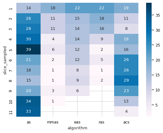
The plot produced by heatmap from model seaborn can help you visualize the joint sampling frequency of two parameters. By default, this plot uses all configuration values on the selected parameters, you can also use argument configs to focus on the selected configurations. You can select two parameters using the parameters argument, or provide only one parameter to visualize its sampling frequency with slice_sampled, that when the configuration sampled.
You can use argument colormap to color the plot, and its available values could be checked using code:
import matplotlib.pyplot as plt
plt.colormaps( )
You can plot heatmap with the param_heatmap method:
cplot.param_heatmap(data=results1, options=options1, parameters='algorithm')
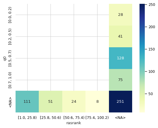
You can draw more flexible heatmap plots via providing parameters configs, parameters, colormap, shownan and nbins. The argument nbins is used to split the domain of continouos paramters.
cplot.param_heatmap(data=results1, options=options1,
                    parameters=['q0', 'rasrank'],
                    shownan=True, colormap='YlGnBu')
#
# Mapping parameter type..
#  (WARNING: convert parameter q0(r) to categorical for plotting)
#  (WARNING: convert parameter rasrank(i) to categorical for plotting)
function param_boxplot
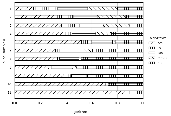
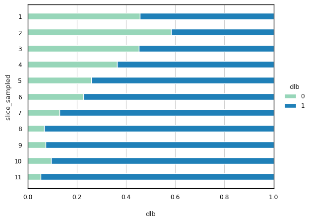
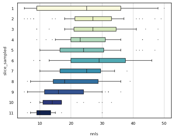
Function param_boxplot can help you visualize the distribution of selected parameter(s). By default, this plot uses all configuration values on the selected parameter(s) and map all value aspects to different slices.
For categorical and continuous parameters, this function produces different visualizations: a normalized stacked bar chart for categorical parameters and a boxplot for continuous parameters, respectively.
You can use argument monochrome to enable or disable coloring the plot, and argument palette to provide an available string value for coloring.
You can plot with the param_boxplot method:
cplot.param_boxplot(data=results1, options=options1, parameters=['algorithm', 'alpha'])
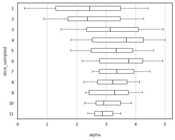
In order to draw more flexible plots, you can provide parameters configs, parameters, y, shownan, showfliers, showmeans, palette and monochrome.
import random
max = results1.configurations.n_config
cplot.param_boxplot(data=results1, options=options1, parameters=['dlb', 'nnls'],
                    configs=random.sample(range(1, max), int(0.5*max)), # random selected a half of configuratioons
                    monochrome=False, shownan=False, palette='YlGnBu',
                    showfliers=True)
function param_jointplot
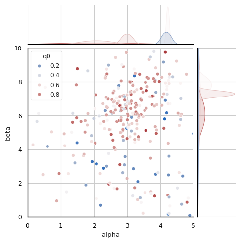
Apart from the heatmap, joint plot is also provided to display the joint sampling frequency of two parameters and the distribution of each parameter. Similar to param_heatmap, by default, this joint plot uses all configuration values on the two selected categorical parameters, you can also use argument configs to draw plot on the selected configurations.
You must provide two continuous parameters using the parameters argument, and you can plot the joint plot by using code param_jointplot:
cplot.param_jointplot(data=results1, options=options1, parameters=['alpha', 'beta'])
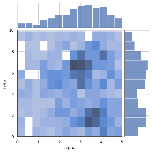
Also, you can draw more flexible joint plots via providing parameters hue, configs, parameters, palette, shownan and kind.
The argument hue is the third parameter provided for plotting the distributions of the selected two parameters on it.
The argument kind is type for the joint plot and its avaliable values are in [‘scatter’, ‘kde’, ‘hist’, ‘hex’, ‘reg’, ‘resid’].
Among these values, [‘hex’, ‘reg’, ‘resid’] are not supported when argument hue is enabled.
cplot.param_jointplot(data=results1, options=options1, parameters=['alpha', 'beta'],
                      hue='q0',
                      kind='scatter',
                      shownan=False)
function param_pairplot
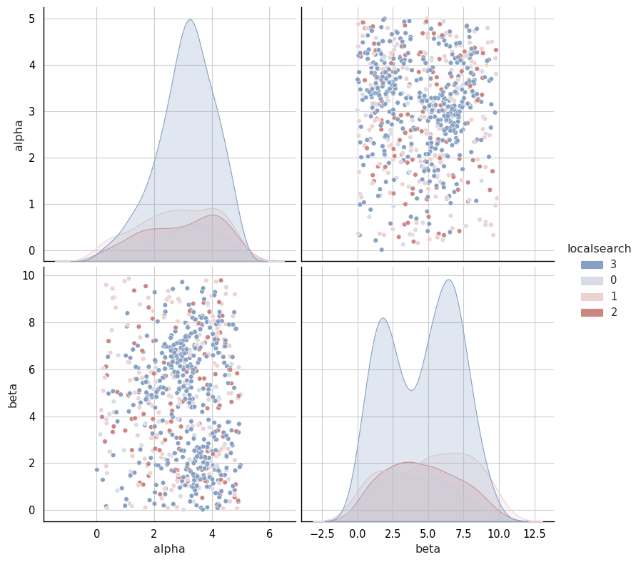
Apart from the heatmap and joint plot, pair plot is also provided to display the pairwise relationships of provided parameters and the distribution of each parameter on the hue parameter. Similar to param_jointplot, by default, this plot uses all configuration values on the selected two categorical parameters, you can also use argument configs to focus on the selected configurations.
You must provide at least two continuous parameters using the parameters argument, and you can plot the pair plot by using code param_pairplot:
cplot.param_pairplot(data=results1, options=options1, parameters=['alpha', 'beta'], hue='localsearch')
To draw more flexible pair plots you can call this function via providing arguments configs, parameters, hue, shownan, palette and kind.
The argument hue is the parameter provided to map plot aspects to different colors for the provided at least two parameters.
The argument kind is the type of plot for the diagonal subplots and its avaliable values are in [‘auto’, ‘hist’, ‘kde’, None]. If ‘auto’, choose based on whether or not hue is used.
The argument shownan enables or disables the inclusion of NaN values for the selected parameters.
In the case of mutually exclusive parameters, setting shownan=False results in empty intersections.
cplot.param_pairplot(data=results1, options=options1,
                     parameters=['q0', 'rasrank', 'elitistants'],
                     hue='algorithm',
                     kind='auto',
                     shownan=False,
                     height=3)
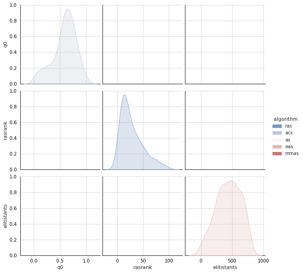
As shown in the above plot, when there is no joint sub-plots, it means all selected parameters are mutually exclusive.
function param_histplot
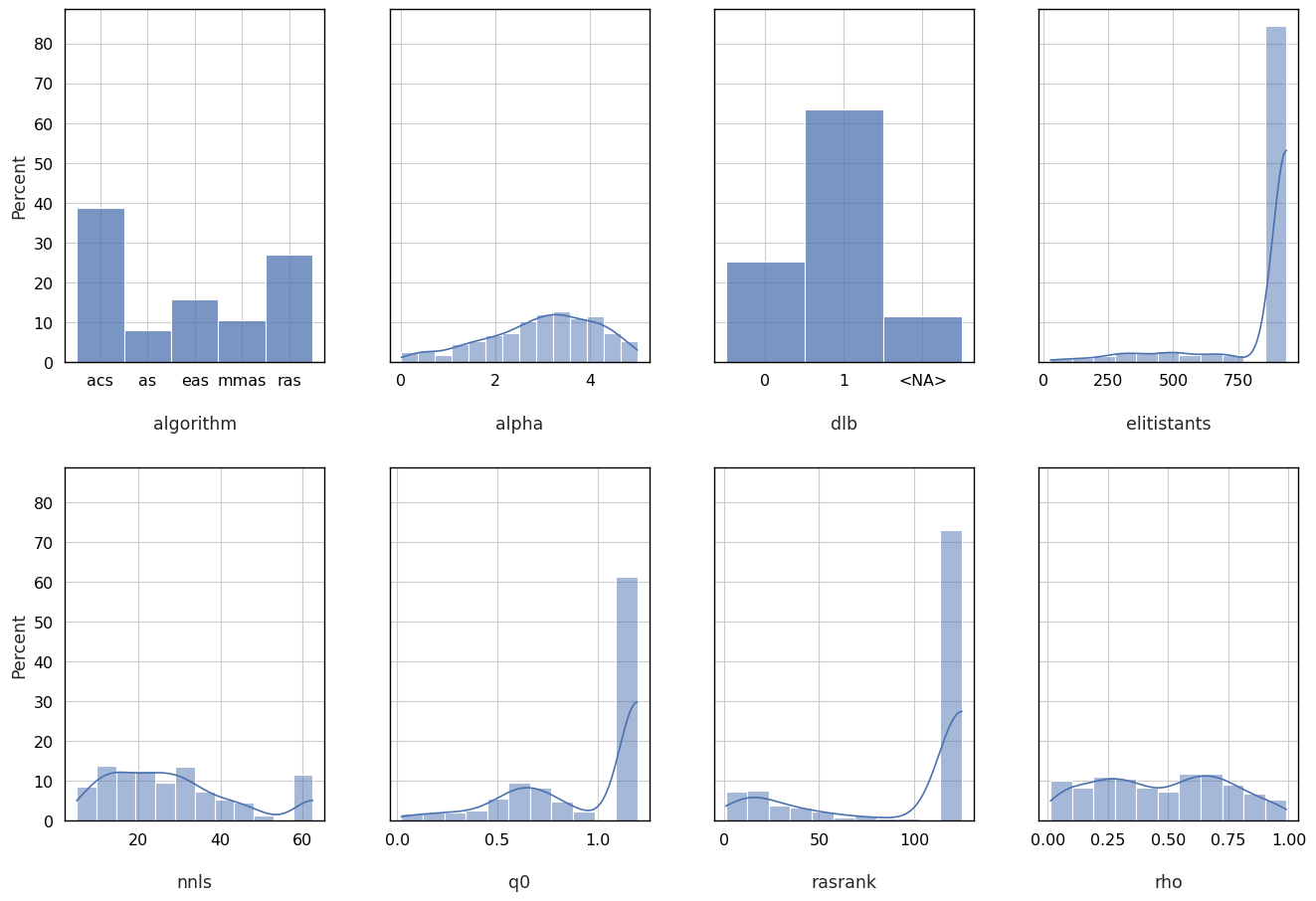
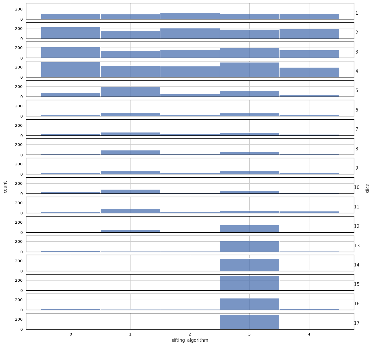
In some cases it might be interesting to have a look at the values sampled during the racing procedure as a distribution. Such plot shows the areas in the parameter space where crace detected a high performance. A general overview of the distribution of sampled parameters values can be obtained with the param_histplot which generates frequency and density plots for the sampled values of selected parameters.
The plot produced by histplot from model seaborn, and by default, the plot randomly selects 6 parameters from all sampled configurations.
cplot.param_histplot(data=results1, options=options1)
#
# No parameters selected to draw plot, set to the default(random selected 8 parameters).
#    selected parameters: algorithm, alpha, dlb, elitistants, nnls, q0, rasrank, rho
In order to draw more flexible plots for the distribution of selected parameters, you can provide arguments configs, parameters, shownan, stat, density, sharex and sharey.
stat is a string from provided values [‘count’, ‘frequency’, ‘probability’, ‘percent’, ‘density’] for the type/shape of plots and its default value is ‘percent’.
cplot.param_histplot(data=results2, options=options2,
                     configs='all',
                     parameters='sifting_algorithm',
                     slice=True,
                     stat='count',
                     density=True,)
Experiments
crace automatically tune configuration parameters on the basis of the returned metric of configuration on instance. It is the length of tour when tuning Traveling Salesman Problems (TSP), and the runtime of single execution when tuning Mixed-Integer Programming (MIP) problem.
Once crace is executed, you might also interest in how the configurations perfom during the tuning process or in the testing phase. craceplot provides several ways to draw plots for these.
function qual_boxplot
Function qual_boxplot can help you visualize the performance of selected configuration(s).
You must provide data in CraceResults format, the source of data (training or testing) you select for plotting, and the number of configurations you wish to use.
Addtionally, you need to provide some plot arguments as well.
You can plot with the qual_boxplot method:
cplot.qual_boxplot(data=results1, options=options1, source='training', num='all')
#
# Adjusted p-values of the last two elite configurations:
        495     588
495  1.0000  0.3503
588  0.3503  1.0000
588 vs. 495: Wilcoxon test (paired samples) with Benjamini-Hochberg correction, P_val:3.503e-01 Stat=6.100e+02
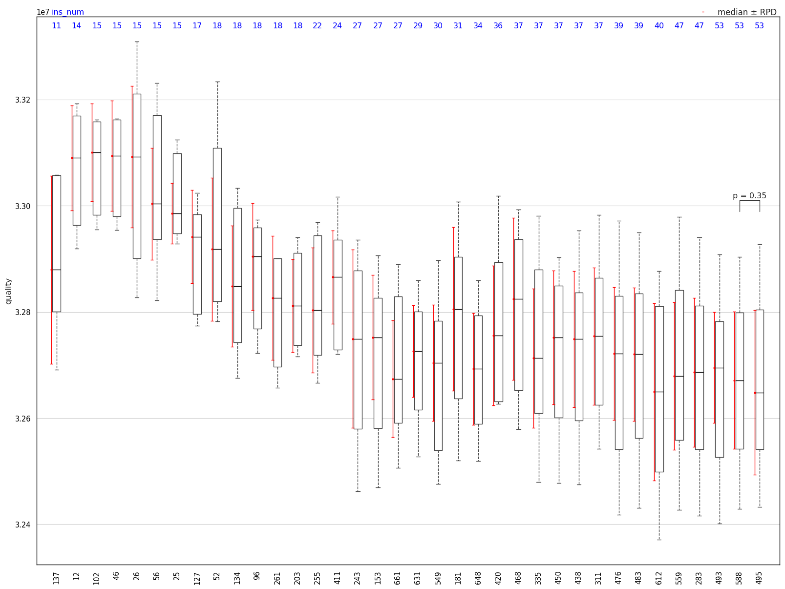
In this example, data is from ACOTSP and this plot is drawn on the training process for all elite configurations selected in this phase. Blue numbers on the top are numbers of used instance of each configuration, while black numbers on the bottom are configuration ids.
function qual_heatmap
Function qual_heatmap can help you visualize the performance of all configurations on selected instances.
You must provide data in CraceResults format and the source of data (training or testing) you select for plotting.
cplot.qual_heatmap(data=results1, options=options1, source='training', as_html=True)
cplot.qual_heatmap(data=results2, options=options2, source='training', as_html=True)
function qual_scatter
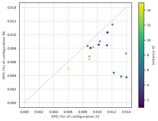
Function qual_scatter can help you compares the performance of the best configuration with that of selected configurations across a set of instances.
You must provide data in CraceResults format, options in CplotOptions format, the source of data (training or testing) you select for plotting, and selected configurations.
When you provide more than two configurations, it will randomly select two from the provided.
You can plot with the qual_scatter method:
cplot.qual_scatter(data=results1, options=options1, source='training', num='elites')
#
# More than two configurations are selected for drawing scatter plot.
#    selected configurations: [25, 96]
configuration_id         bests            25          96
1                 3.297078e+07  3.334691e+07  33310604.0
2                 3.230902e+07  3.260211e+07  32568431.0
3                 3.236975e+07  3.270024e+07  32645096.0
4                 3.262494e+07  3.299474e+07  32899716.0
5                 3.252999e+07  3.298572e+07  32650813.0
6                 3.267271e+07  3.307386e+07  32815876.0
7                 3.268958e+07  3.312408e+07  32814478.0
8                 3.270123e+07  3.298522e+07  32973177.0
9                 3.253550e+07  3.292888e+07  32908667.0
10                3.301230e+07  3.335485e+07  33309952.0
11                3.248712e+07  3.294075e+07  32721955.0
12                3.298619e+07  3.328104e+07  33210152.0
13                3.264763e+07  3.295563e+07  32913495.0
14                3.271992e+07  3.301147e+07  32927688.0
15                3.277163e+07  3.296852e+07  32934756.0
mean              3.266855e+07  3.301693e+07  32906990.4
Note: bests represents an oracle configuration, constructed by selecting, for each instance,
	  the configuration that achieves the best performance.